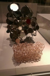
To the V&A Museum, for only the second time in my life, to visit the Heatherwick Studio exhibition. I must admit I’d not been aware of Thomas Heatherwick until the Olympic Cauldron, though of course his design for the new London Routemaster Bus had been on the periphery of my awareness too. A couple of thoughts struck me:

The Comedy of Design
I was impressed with what I saw, and there was a definite theme which emerged from the exhibition as a whole – that of taking a material, pushing it to its’ limits, and stretching, straining it into different shapes and uses. It almost felt that Heatherwick was researching a material, or a product, and taking it to its logical conclusion, or even an illogical one. The plank which could be disguised as furniture; the rolling bridge; the stretchy, re-mouldable furniture and carpets; the zip bag – all of these felt like magic tricks, or jokes. The equivalent of a Monty Python sketch, it really did feel like comedy, expressed in manufacturing. There’s something in that, but I’m not quite sure what, just yet. His works felt almost unashamedly futuristic, immaculately researched but also almost from a naive, playful starting point – why *not* do this with a material – again, every piece felt like it was playing a joke on the original brief – c.f. this almost Bond-villain-esque boat design. I like that.
Web Design as Art
The other thing is something that I think about every time I go to a museum. We regard sculpture, painting, music, writing, even manufacturing as works and processes of art. But when it comes to the Web, our approach is often couched in very utilitarian terms – either in that of technical prowess, or from a position of usability. Not that there’s anything wrong with either of those – but it feels like currently there’s not much consideration for web design as an art form. And by that I don’t mean interaction design or visual/screen design – those are catered for. I mean the design of webs. They shouldn’t just be functional. They can be elegant, they can be works of art, too. I’d love there to be more art based on this. I’m sure there’s been similar, looking at things from a more mathematical/theoretical point of view around networks, but why not have exhibitions devoted to great design of webs. The design of a website is so often a careful balance of technical constraints, usability and art, we should be proud of it, and make more of it. Break it free from the screen, and show the topology of different websites. Study it, learn from it – but also allow more artistic freedom in it. Is there comedy in web design, too? (and not just in ‘bad’ design, of course!)
I imagine an exhibit of a dark room, filled with laser/light-emitting objects, perhaps similar (but much less deadly) to those found in the Portal series of games. Each object represents a node of a website. Each object emits a light in the dark, which connects it to another object. Perhaps the light also spells out the semantic link. The objects fill the room, and a visitor can type in a website, and, in a short space of time, the lights reconfigure to represent the topology of that website. Perhaps even make it so people can wander amongst the links, navigating the Web – breaking the links, too – redirecting them. Make the design of the Web almost physical, but forget the screens. That would be an interesting exhibit. Reminds me, too, of Listening Post.
Perhaps the final thing to think about is the way in which we conceive of the world when we think of computers – so often we think of pixels – boxes that sit snugly against each other, and we build stuff out of them. Perhaps we need to think more about networks, and re-imagine worlds out of them.