Category Archives: Semantic Web

From Void, to Matter, to Meaning

Earlier today, Dan Klyn retweeted a piece by Cennydd Bowles entitled ‘Void and matter’. It’s an interesting spin on the age old question of ‘what is information architecture?’, and more specifically, how the practice differs from other types of User Experience Design, such as Interaction Design.

Back in 2008, I had no idea what information architecture was. I started to attend the BBC’s IA team meetings, thanks to the generous invite of Karen Loasby, despite me not being a member of that team just yet, and there was plenty of talk of ‘defining the damn thing’.

More recently, Abby Covert, amongst several others, has done stirling work to reinvigorate the practice and consideration of IA. I’m loathe to open up the definition can of worms, but I started thinking about it in response to Cennydd’s piece, and I came up with this:

Information Architecture is the design of structures and/or systems that communicate meaning.

By which I mean — almost everything in the world conveys meaning of some sort, whether it is intended to, or not. Hence apophenia (23). But when you do design things in order to communicate some kind of meaning or idea, you are designing an information architecture. This, of course, sounds similar to ‘information design’, I suppose — though I’d argue the latter is perhaps less focused on structures and systems.

If you ever find yourself looking at a piece of web design (let’s narrow it down to that for now), and you wonder — but what does it actually mean, what is it trying to communicate? Then you’re thinking with an information architecture hat on. And, more importantly, to not consider the meaning, or indeed the perception, or what exactly someone is meant to take away from your design, is a huge failing. Which is why I can’t understand UX processes that don’t seriously make time for IA — and probably why IAs who do care so passionately about the meaning of things do get so easily drawn into ‘defining the damn thing’.

Anyway — to Cennydd’s piece directly. What I very much like is the distinction between designing “things that are smaller” than the designer, and “things that are larger”. It reminds me of the old adage that you should always design your product, system, platform or service to be able to fit into a larger system. Don’t just think of your work as the be all and end all — allow it to enable things you’ve not even thought of.

Cennydd also makes an interesting metaphor in “designing the void” versus “designing the matter”. But here’s where I’d like to stress something — designing the matter is absolutely information architecture as well. This isn’t a criticism of the piece — there are no definitive ‘correct’ answers here — I’d just like to offer my spin on something I feel really needs to be highlighted, else IAs (and other UX folk) feel they’re off the hook.

The examples that Cennydd gives — “the tools people manipulate. Materials with properties and responses”. Now, more than ever, information architects need to get involved here. Because the matter we’re creating on the Web is made almost entirely of information structures.

Think about APIs, think about URIs for Things, think about domain driven design with its classes and properties — those are the tools we make available to manipulate, these are the things that we grapple with on the Web.

Information Architects need to be involved in designing the matter on the Web. Interaction Designers need to understand APIs, URIs for resources, linked data (yes, I know), REST and so on. Because that is the raw material we’re dealing with here — networked, interactive information. Designing the matter is the real Web design. And whatever your UX leaning, understanding that is key to harnessing the wonderful medium we have at our disposal.
This post is also available on Medium.

Some quick thoughts on URLs

This past week, there’s been a kerfuffle about an experiment within Google’s Chrome browser which hides URLs from the user. Lots of good folk have chipped in (three posts there, to give you an overview), which is good, but here’s a few thoughts before I forget to write this at all:

– As with any design decision, this has good and bad points. The discussion needs to be level-headed and focus in on the issues that the decision is trying to solve, and work out, clearly, what those issues are, and whether there are better ways of solving them.

– For instance, this has been described as (and I’m paraphrasing here) ‘using a sledgehammer to crack a nut’. That may well be true. What’s important, I think, is to have a public, open space where someone can say ‘hey, this is an issue in all modern browsers, let’s discuss how we might solve this’ – rather than announcing that some internal team has made a design decision and haven’t (as yet) explained their rationale. Again, this last point is key – show your working, explain your thinking. If you don’t, someone else will try to join the dots for you.

– The security faults and general ‘WTF’ of URLs to the ‘average’ user is such an issue. But I’m not convinced this is necessarily the best way to improve it. I might well be wrong, but let’s discuss it.

– Sir Tim Berners-Lee’s first browser didn’t show URLs. URLs were never designed to be seen by the user. Indeed, being visible leads to one of the most unfortunate side effects – people feel they have to be human readable. Now, I’m not saying that they shouldn’t be human readable, but it’s more that people often prioritise that aspect over, in my opinion, their key feature – they should be permanent and unique. Human readability is the next step after that (as is a clear, logical rationale, that makes them hackable).

– URL design, however, is, in my experience, a very sadly neglected art, with key principles, hard decisions and a profound impact on the user experience (if you read one article from this post, make it that one). Hiding the URLs, I agree, could easily lead to less effort being spent on crafting them well. Out of sight, out of mind, as it were. On the other hand, as above, it could take them out of the spotlight and therefore more easily kept in the hands of those who care about getting these things right.

– Equally, talk of ‘the death of the Web’ can be mis-interpreted, very easily, to have the same effect – those who don’t follow this stuff closely will thus assume that they don’t need to care about such things, and it all goes to hell. Basically, drama can multiply the negative effect, as well as drawing attention to the potential damage being caused.

– Whilst I don’t think there’s necessarily a sinister motive behind the experiment, I do agree with ntlk that this kind of thing could easily play into the hands of entrenched, powerful players – sleepwalking into an I intended consequence – and we shouldn’t let that happen without a fight.

– I dearly hope that the idea of the sustainable Web comes to fruition – as Dan Hon says, “One that is kind of adjacent to the indie web, but that builds long-lasting, reliable services, not ones that disappear”. I hope this happens in the industry. Because then we might finally start taking URL design, and hey, maybe a site architecture that is a Web, rather than a hierarchical file directory, seriously as a topic, both in terms of development and UX.

Update One: As expected/hoped for, Michael Smethurst has written something more precise on the topic – go read that.

Update Two: Please don’t get me started on these really, really stupid vanity TLDs like .london and so on. They are pretty much pointless, for people wanting to be duped into paying money for the latest fad. Sorry. It makes me angry. But hey, if it’s ‘seen to be important’, why not go ahead and buy a .HORSE domain name?

Designing Webs – Euro IA 2013

On Saturday, I presented a talk at Euro IA 2013 called ‘Designing Webs – Information Architecture as a Creative Practice‘. Rather than write the talk up in full, for now, I’ll just link you to the slides (with my speaker notes), Martin Belam’s write-up, and Boon Yew Chew’s sketch-notes (ooh, my first ever sketch-notes!).

This talk was a long time in coming. The ideas contained within have been bubbling around my head for most of the year, indeed, ever since I (re)discovered TARDIS Eruditorum and, at the same time, was pointed to John Higgs’ book about the KLF (thanks, Libby!). Reading both at the same time, the connections between Alan Moore’s concept of magic, the ideas of alchemy, and linked data/internet of things, were both fascinating and strangely familiar.

I wasn’t the first to make these kind of connections – Dan Catt has touched on similar things with his Artisanal Numbers project. Indeed, a lot of the content of the talk owes much to others – Michael Smethurst, Leila Johnston, Alyson FieldingTom Coates, Tom Armitage, James Burke, James Bridle, Russell Davies – all far cleverer and more accomplished than I. And yet, I wanted to draw all these threads together. I’ve had about three draft versions of blog posts just touching on the magic/alchemy thing sitting on WordPress for ages, and I could never quite get it to gel. The talk, being forty-five minutes (or just under, once I’d cut out the various comedy clips I was going to include, given the rather tenuous Edinburgh Fringe connection), doesn’t cover all the ideas I would have liked to, or in enough depth. I’ve probably been far too simplistic about the ideas of the people I’ve mentioned above, but there is frankly loads to say. Indeed, I’m hoping that an upcoming episode of Henry Cooke‘s Unevenly Distributed podcast will expand on a few of them (it was recorded a month or so prior to writing this talk).

I’d also like to explore the themes a lot more – getting my hands dirty with Arduinos, bringing to life the Internet of Fictional Things and so on. Also, I can certainly see how the talk might be perceived as a little too wooly, hand-wavy, naive. In response, I’d say that yes, the magic/alchemy thing is just a metaphor, albeit a really interesting and fun one for me, but there are practical points underpinning it. Not least that by thinking of your product, service or creative work as a web, rather than purely as a website, you get to the absolute essence of what it is – which helps you design for both now and the future. Martin makes the point that when redesigning the Guardian’s Culture section, he tried a similar approach – yes, it’s not necessarily easy or possible to complete the task straight away, but remember, you’re trying to build something that will last, something that will add to human culture and society in the long run – something which one day we may not even need a screen or visual interface to interact with – we might be able to appreciate each web for what it is.

So, yes, there it is. Thank you to all those who encouraged me to write the talk, refine it and so on – oh, and one note of caution – the domain model for sport (really just football) which is at the beginning (and you may have seen in a much more visually appealing state in some of Mike Atherton and even Louis Rosenfeld’s presentations) – that’s not actually the official BBC one, it’s one I created myself a while back, but has influenced the BBC’s Sport Ontology.

BBC Programmes and a Web of Data – A History

Now and then, I’m fascinated by the period in the BBC’s development around the mid 2000s when it seemed as though people really started to grok the possibilities of the Web. It’s possibly just me, but it often seems as though the world we live in now has forgotten all this promise (perhaps like the ‘horse in the Apple Store‘ idea). And indeed, I often forget the sense of exploration and wonder from some of my early blog posts here on narrative modelling, assuming that’s all settled, accepted and boring now.

Anyway, there’s something about standing on the shoulders of giants, being behind/ahead of the times, collective forgetting of a movement if it’s not shared, and all that, awaiting a different post – a kind of retrospective, and perhaps needless nostalgia for those times, but for now, here’s the twenty-two links I was able to source via Twitter this evening on the subject, organised (approximately) by author – expect this to be tidied up in time:

http://www.frankieroberto.com/weblog/1621

http://www.frankieroberto.com/weblog/898

http://www.bbc.co.uk/blogs/radiolabs/2007/12/show_your_workings.shtml

http://www.bbc.co.uk/blogs/radiolabs/2008/07/some_ical_views_onto_programme.shtml

http://www.gyford.com/phil/writing/2007/10/19/bbc_programmes.php

http://www.plasticbag.org/archives/2004/06/the_new_radio_3_site_launches/

http://www.plasticbag.org/archives/2004/06/developing_a_url_structure_for_broadcast_radio_sites/

http://www.plasticbag.org/archives/2005/03/on_reinventing_radio_enhancing_onetomany_with_manytomany/

http://archive.org/details/NativeToAWebOfData

http://www.plasticbag.org/files/misc/pips_etech.pdf

http://lanyrd.com/2005/etech/sfzp/

http://www.cityofsound.com/blog/2004/07/ripples_or_the_.html

http://www.cityofsound.com/blog/2006/03/why_lost_is_gen.html

http://www.cityofsound.com/blog/2006/01/work_quick_revi.html

http://www.flickr.com/photos/mildlydiverting/tags/wireframes/

http://www.bbc.co.uk/blogs/radiolabs/2008/06/the_simple_joys_of_webscale_id.shtml

http://web.archive.org/web/20060220172755/http://www.hackdiary.com/slides/xtech2005/

http://www.fabricoffolly.com/2008/06/bbc-radio-player-happy-birthday-rip.html

http://www.fabricoffolly.com/2007/12/chat-around-tv.html

http://www.tomski.com/archive/new_archive/000063.html

http://vanirsystems.com/danielsblog/2008/02/18/semanticcamplondon-favourite-photo/

http://smethur.st/one-from-the-archive-the-programmes-manifesto

Heatherwick, Comedy and Web Art

To the V&A Museum, for only the second time in my life, to visit the Heatherwick Studio exhibition. I must admit I’d not been aware of Thomas Heatherwick until the Olympic Cauldron, though of course his design for the new London Routemaster Bus had been on the periphery of my awareness too. A couple of thoughts struck me:
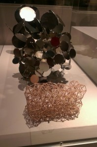
Heatherwick Studio Exhibition
The Comedy of Design

I was impressed with what I saw, and there was a definite theme which emerged from the exhibition as a whole – that of taking a material, pushing it to its’ limits, and stretching, straining it into different shapes and uses. It almost felt that Heatherwick was researching a material, or a product, and taking it to its logical conclusion, or even an illogical one. The plank which could be disguised as furniture; the rolling bridge; the stretchy, re-mouldable furniture and carpets; the zip bag – all of these felt like magic tricks, or jokes. The equivalent of a Monty Python sketch, it really did feel like comedy, expressed in manufacturing. There’s something in that, but I’m not quite sure what, just yet. His works felt almost unashamedly futuristic, immaculately researched but also almost from a naive, playful starting point – why *not* do this with a material – again, every piece felt like it was playing a joke on the original brief – c.f. this almost Bond-villain-esque boat design. I like that.

Web Design as Art

The other thing is something that I think about every time I go to a museum. We regard sculpture, painting, music, writing, even manufacturing as works and processes of art. But when it comes to the Web, our approach is often couched in very utilitarian terms – either in that of technical prowess, or from a position of usability. Not that there’s anything wrong with either of those – but it feels like currently there’s not much consideration for web design as an art form. And by that I don’t mean interaction design or visual/screen design – those are catered for. I mean the design of webs. They shouldn’t just be functional. They can be elegant, they can be works of art, too. I’d love there to be more art based on this. I’m sure there’s been similar, looking at things from a more mathematical/theoretical point of view around networks, but why not have exhibitions devoted to great design of webs. The design of a website is so often a careful balance of technical constraints, usability and art, we should be proud of it, and make more of it. Break it free from the screen, and show the topology of different websites. Study it, learn from it – but also allow more artistic freedom in it. Is there comedy in web design, too? (and not just in ‘bad’ design, of course!)

I imagine an exhibit of a dark room, filled with laser/light-emitting objects, perhaps similar (but much less deadly) to those found in the Portal series of games. Each object represents a node of a website. Each object emits a light in the dark, which connects it to another object. Perhaps the light also spells out the semantic link. The objects fill the room, and a visitor can type in a website, and, in a short space of time, the lights reconfigure to represent the topology of that website. Perhaps even make it so people can wander amongst the links, navigating the Web – breaking the links, too – redirecting them. Make the design of the Web almost physical, but forget the screens. That would be an interesting exhibit. Reminds me, too, of Listening Post.

Perhaps the final thing to think about is the way in which we conceive of the world when we think of computers – so often we think of pixels – boxes that sit snugly against each other, and we build stuff out of them. Perhaps we need to think more about networks, and re-imagine worlds out of them.